
Yale Single Sign-On Redesign
Creating a cohesive, accessible, and secure authentication experience for Yale's 35,000+ community members
Project Overview
The Yale Single Sign-On (SSO) system is the primary authentication gateway for the entire Yale community, serving over 35,000 students, faculty, and staff. As the digital front door to Yale's services, it needed to reflect Yale's brand identity, provide a seamless user experience, and maintain the highest security standards.
I was tasked with redesigning the entire authentication flow, including the login screen, password reset process, and account management interface. This project required balancing institutional requirements, security best practices, and user-centered design principles.
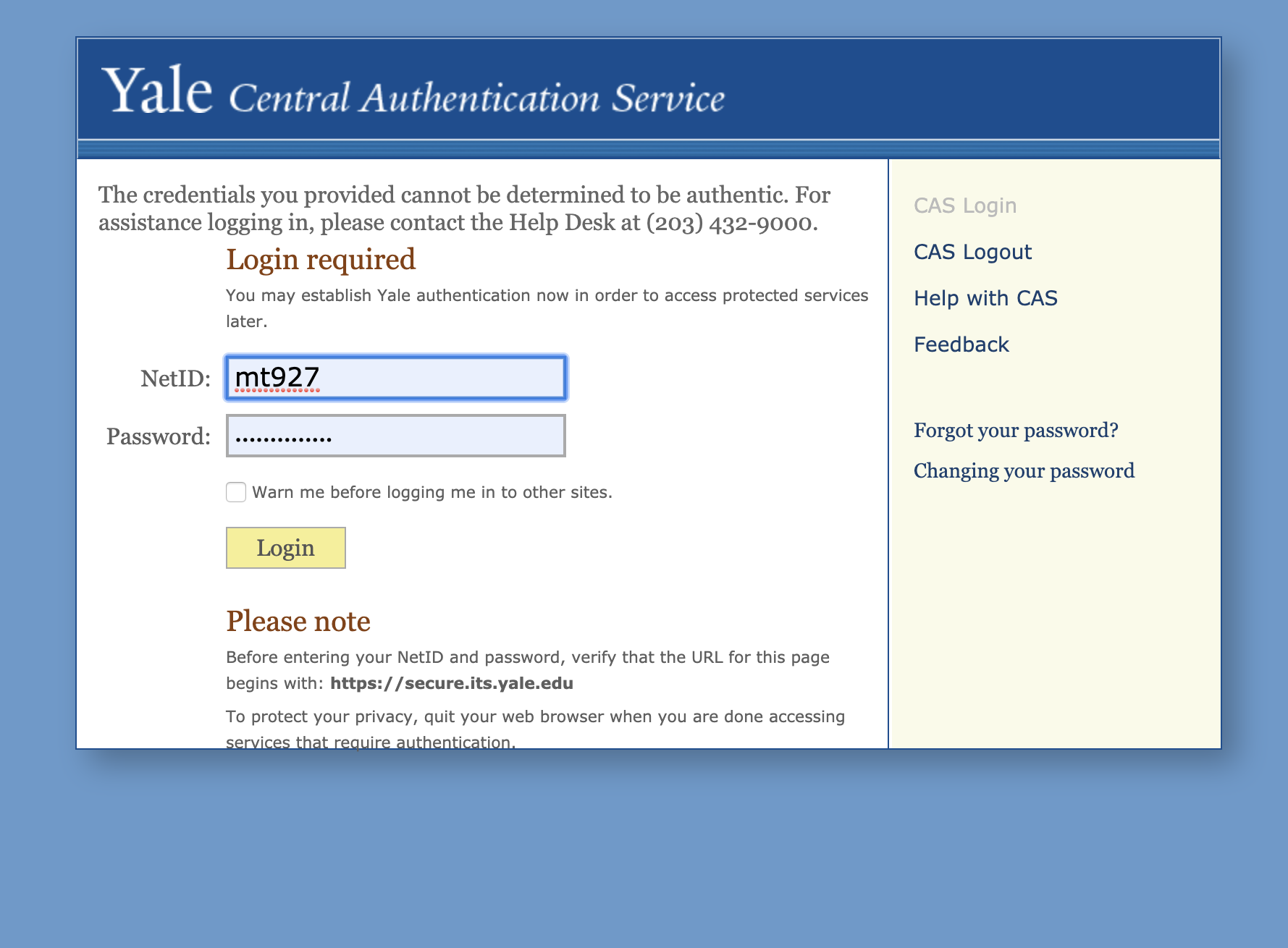
Problem Statement
The existing Yale SSO system suffered from several critical issues:
- Inconsistent branding and visual design across different authentication screens
- Poor accessibility, creating barriers for users with disabilities
- Unclear error messages and recovery paths when authentication failed
- Limited responsive design, resulting in frustrating mobile experiences
- Difficult password reset flow that led to high support ticket volumes
These issues not only created a frustrating user experience but also compromised security by encouraging workarounds and increasing support costs through unnecessary help desk calls.
"The login page is the most frequently used page at Yale, yet it was failing to meet basic usability and accessibility standards."
- Findings from initial user researchUser Research
Research Methodology
To deeply understand the problems with the existing system, I conducted:
- Analysis of help desk tickets related to login issues (500+ tickets reviewed)
- Contextual interviews with 15 users across different roles (students, faculty, staff)
- Accessibility audit using WCAG 2.1 AA guidelines
- Usability testing with 8 participants, including users with disabilities
- Competitive analysis of authentication systems at peer institutions
Key Findings
The research revealed that users were particularly frustrated by:
- Confusing error messages that didn't clearly explain what went wrong
- Lack of guidance when password requirements weren't met
- Difficulty navigating the system on mobile devices
- Inconsistent visual cues and branding across different screens
- Poor screen reader compatibility and keyboard navigation
Design Process
1. Define Requirements
Collaborated with IT security, identity management team, and accessibility experts to establish technical and compliance requirements.
2. Information Architecture
Mapped user flows for all authentication paths, including edge cases and error states.
3. Wireframing
Created low-fidelity wireframes focusing on structure, content hierarchy, and interaction patterns.
4. Visual Design
Developed high-fidelity mockups aligned with Yale's brand guidelines while ensuring accessibility.
5. Prototyping
Built interactive prototypes for user testing and stakeholder review.
6. Testing & Iteration
Conducted multiple rounds of usability testing and made iterative improvements.
7. Implementation
Worked closely with developers to ensure design fidelity and accessibility compliance.
Design Considerations
Throughout the design process, I focused on several key principles:
- Accessibility First: Ensuring the design met WCAG 2.1 AA standards and worked well with assistive technologies
- Mobile Responsiveness: Creating a consistent experience across all device sizes
- Clear Communication: Providing helpful feedback and error messages in plain language
- Security vs. Usability: Balancing security requirements with user convenience
- Yale Brand Identity: Maintaining consistent branding that reinforced trust
Solution
Key Design Solutions
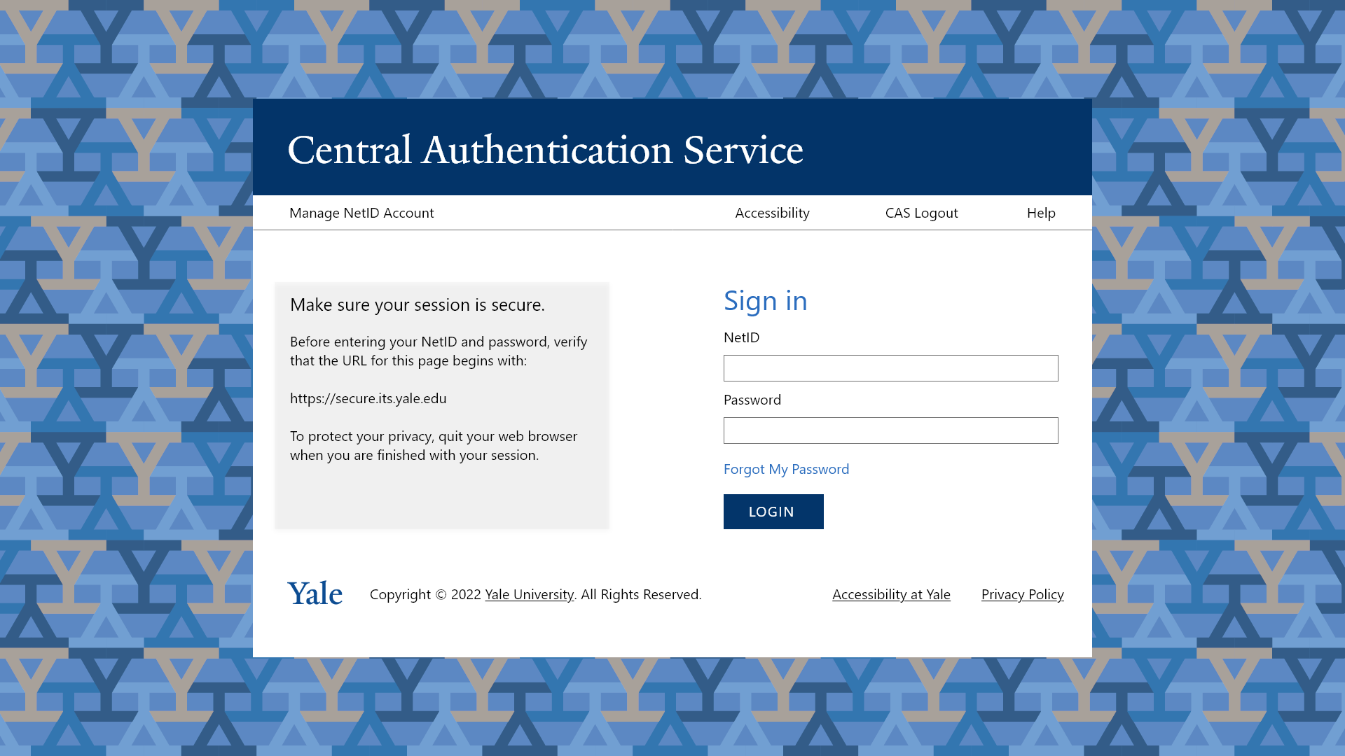
1. Redesigned Login Screen
The new login screen features:
- Clear Yale branding with the Yale logo and color scheme
- Simplified layout with focus on essential elements
- Prominent "Need Help?" options for password recovery
- Responsive design that adapts to all screen sizes
- High contrast elements and keyboard-navigable interface
2. Improved Error Handling
I completely redesigned the error messaging system to:
- Use plain language that explains what went wrong
- Provide clear, actionable next steps
- Display errors inline next to the relevant fields
- Use appropriate ARIA attributes for screen reader users
- Maintain security by not revealing too much information
3. Streamlined Password Reset
The new password reset flow:
- Reduced the number of steps from 7 to 4
- Added real-time password requirement validation
- Included progress indicators for multi-step processes
- Offered multiple recovery options (email, phone, security questions)
- Provided clear confirmation of successful actions
4. Account Management Dashboard
A new self-service dashboard allows users to:
- View and update their profile information
- Manage their security settings
- Set up and update recovery options
- View recent account activity for security monitoring
- Access help resources and FAQs
Testing & Validation
Before launch, I conducted comprehensive testing to validate the design:
Usability Testing
Conducted moderated usability tests with 12 participants representing different user groups. Key tasks included:
- Standard login process
- Recovering from various error states
- Completing the password reset flow
- Managing account security settings
Accessibility Testing
Performed thorough accessibility testing, including:
- Screen reader testing with NVDA and VoiceOver
- Keyboard navigation testing
- Color contrast analysis
- Testing with magnification tools
- Automated WCAG 2.1 AA compliance checks
A/B Testing
Conducted A/B testing with a small percentage of users to compare:
- Login completion rates
- Time to successful authentication
- Error recovery success rates
- Support ticket generation rates
"The new SSO design is significantly more intuitive. I can finally use the password reset function without calling the help desk."
- Participant in usability testingResults & Impact
The redesigned Yale SSO system launched to the entire Yale community in phases, with full deployment completed within one month. The impact was significant and measurable:
Additional Outcomes
- The redesigned system became a campus-wide standard for authentication interfaces
- The design system and components were adopted for other Yale web applications
- The project received recognition from Yale's Office of Digital Accessibility
- The IT support team reported significantly fewer escalations related to authentication
Lessons Learned
Balancing Security and Usability
One of the most significant challenges was finding the right balance between stringent security requirements and user-friendly design. Through close collaboration with the security team, we found ways to maintain robust security while improving the user experience.
Inclusive Design Benefits Everyone
By prioritizing accessibility from the beginning, we created a system that was not only better for users with disabilities but also improved the experience for all users, particularly in challenging contexts like mobile usage and poor network conditions.
The Importance of Error States
The project highlighted how crucial well-designed error states are to the overall user experience. By investing time in creating clear, helpful error messages, we significantly reduced user frustration and support costs.
Iterative Testing Pays Off
Multiple rounds of testing with diverse user groups helped us catch issues early and refine the design before full implementation, ultimately saving time and resources while delivering a better final product.