Timex Family Connect
Designing a seamless wearable experience connecting families through a child-friendly smartwatch
Project Overview
Timex Family Connect is a smartwatch and companion mobile app designed to help parents stay connected with their children. The device offers GPS tracking, messaging, and scheduling features in a kid-friendly package. As the UX designer on this project, I was responsible for creating the end-to-end user experience for both the smartwatch interface and the companion iOS and Android applications.
Problem Statement
Parents want to give their children independence while ensuring their safety, but existing solutions were either too complex for children to use, lacked intuitive parent controls, or didn't provide the right balance of features and simplicity.
The challenge was to create a wearable device and mobile application that would:
- Be intuitive and engaging for children ages 5-12
- Provide parents with peace of mind through location tracking and communication
- Balance functionality with simplicity in both the watch and app interfaces
- Create a seamless connection between the physical device and digital experience
- Differentiate from competitors through thoughtful UX and Timex's trusted brand
Research & Discovery
Understanding the Users
We conducted extensive research to understand both primary user groups:
Key Research Findings
- For Parents: Safety was the primary concern, followed by ease of use. Parents wanted reliable location tracking, simple communication, and quick access to critical functions.
- For Children: Engagement and "cool factor" were essential. Children needed intuitive interfaces with minimal text, engaging visuals, and simple navigation.
- Competitive Analysis: Existing products often prioritized features over usability, creating complex interfaces that frustrated both parents and children.
"I just want to know my kids are safe when they're at a friend's house or walking home from school. But most of these tracking devices are either too complicated or don't work reliably."
- Parent participant during user researchDesign Process
1. Define Requirements
Collaborated with product managers and engineers to identify technical constraints and feature priorities.
2. User Personas & Scenarios
Created detailed personas for both parents and children, with realistic usage scenarios to guide design decisions.
3. Information Architecture
Developed distinct information architectures for the watch interface and mobile app, optimizing each for their primary users.
4. Wireframing
Created low-fidelity wireframes for key user flows, focusing on simplicity and intuitive navigation.
5. Visual Design
Developed high-fidelity mockups with a child-friendly aesthetic for the watch and a clean, trustworthy design for the parent app.
6. Prototyping & Testing
Built interactive prototypes and conducted usability testing with both parents and children.
7. Refinement & Implementation
Iterated on designs based on feedback and worked closely with developers during implementation.
Design Challenges
Challenge 1: Designing for Small Screens
The watch face offered limited screen real estate, requiring extremely focused design decisions. We needed to create an interface that children could easily navigate while incorporating all necessary functionality.
Challenge 2: Balancing Parent Control with Child Autonomy
We needed to give parents the oversight they needed while allowing children to feel like they had their own device, not just a tracking tool. This required thoughtful decisions about which features would be controllable by parents versus children.
Challenge 3: Creating Intuitive Communication
Many children in our target audience couldn't type efficiently. We developed a unique combination of pre-set messages, voice notes, and emojis to enable quick, engaging communication that worked for children of various ages and abilities.
Solution
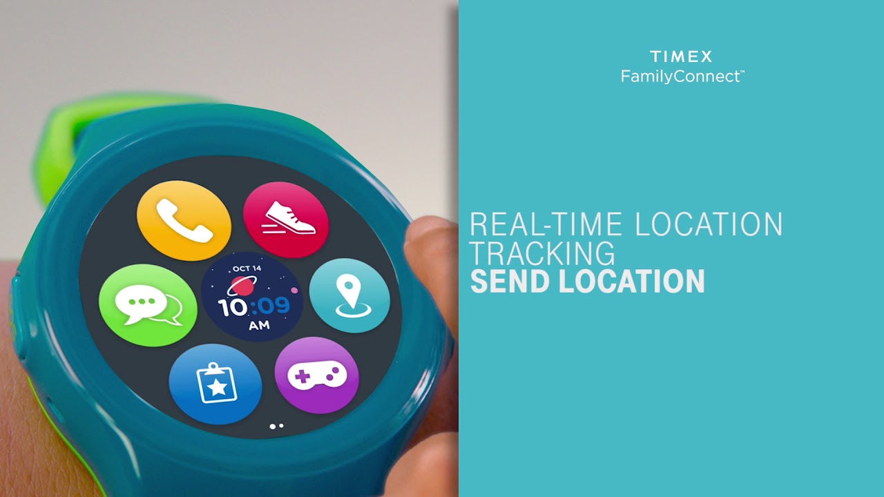
Watch Interface
The final smartwatch interface featured:
- Large, colorful icons and minimal text to support young users
- Swipe-based navigation to minimize the need for precise tapping
- Voice-first interaction for messaging and commands
- Playful animations and sounds to provide feedback and engagement
- Simplified settings that children could manage independently
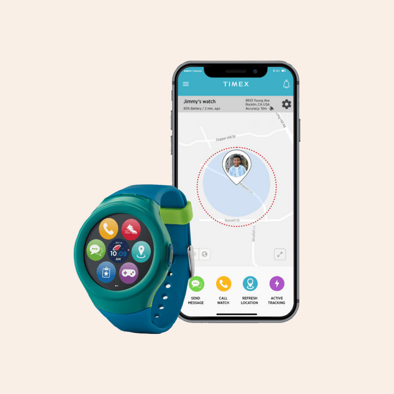
Parent Mobile App
The companion mobile app was designed to provide parents with:
- An intuitive dashboard showing children's locations and status at a glance
- Simple messaging with conversation history and delivery confirmation
- Geofencing capabilities to create safe zones and receive alerts
- Family calendar and reminder functionality
- Device management and settings control
Key Features
Location Tracking
Real-time GPS tracking with history, safe zones, and customizable alerts provided parents with peace of mind while maintaining a child-friendly presentation on the watch.
Communication Hub
A simplified messaging system allowed for voice messages, preset text responses, and emoji reactions. Parents could communicate directly with their children in a safe, controlled environment.
Family Calendar
Parents could set and manage schedules that would appear on their children's watches, helping establish routines and independence while maintaining oversight.
SOS Function
An easily accessible but protected emergency feature allowed children to quickly alert parents in case of an emergency, with automatic location sharing.
Testing & Iteration
Throughout the design process, we conducted multiple rounds of testing:
Prototype Testing
- Early paper prototypes helped validate the information architecture
- Interactive prototypes in InVision allowed us to test navigation patterns
- Hardware prototypes with basic functionality tested the physical interaction model
Usability Testing
We conducted usability testing with 6 parent-child pairs, observing how they interacted with both the watch and the app. Key tasks included:
- Setting up the device and connecting it to the app
- Sending and receiving messages between parent and child
- Creating and managing safe zones
- Using the SOS function in a simulated emergency
- Managing schedules and reminders
Iterative Improvements
Based on testing feedback, we made several key improvements:
- Simplified the initial setup process to reduce parent frustration
- Enlarged touch targets on the watch interface after observing children's motor skills
- Added confirmation sounds and haptic feedback to improve interaction confidence
- Redesigned the messaging interface to prioritize voice messages over text
- Improved location update frequency based on parent feedback about reliability
Results & Impact
The Timex Family Connect launched successfully and has achieved significant marketplace success:
Common Phrases from User Reviews
"The Timex Family Connect has become an essential part of our family's daily routine. My kids love the independence it gives them, and I love knowing they're just a button press away."
- App Store ReviewWatch the official Timex Family Connect product demo showcasing the key features and functionality.
Lessons Learned
Designing for Dual User Groups
Creating an experience that served both parents and children required constant balancing of different needs, abilities, and expectations. The key was to optimize each interface for its primary user while ensuring seamless communication between them.
Hardware-Software Integration
Working with hardware constraints taught me valuable lessons about efficient interface design and the importance of close collaboration with engineering teams to understand technical limitations early in the process.
Simplicity vs. Functionality
The project reinforced that features should be carefully curated based on user needs rather than competitive pressure. By focusing on core functionality and executing it well, we created a more satisfying product than competitors with more features but poorer usability.
The Value of Iteration
Multiple rounds of testing and refinement were crucial to the product's success. Small usability improvements often had outsized impacts on user satisfaction and retention.