Timex
Timex Family Connect
Designing a seamless wearable experience that connects families through a child-friendly smartwatch — balancing safety, simplicity, and delight for two very different users.
- Role
- UX Engineer
- Timeline
- 8 Months
- Company
- Timex
- UX Design
- Mobile
- Wearables
- Consumer Product
Overview
Timex Family Connect is a smartwatch and companion mobile app designed to help parents stay connected with their children. The device offers GPS tracking, messaging, and scheduling in a kid-friendly package. As the UX designer on this project, I was responsible for the end-to-end user experience for both the smartwatch interface and the companion iOS and Android applications.
The core design challenge: two products, two completely different users, one seamless experience.
Problem Statement
Parents want to give their children independence while keeping them safe — but existing solutions were either too complex for children to navigate, lacked intuitive parent controls, or failed to strike the right balance between features and simplicity.
The challenge was to design a wearable device and mobile application that would:
- Be intuitive and engaging for children ages 5–12
- Give parents peace of mind through reliable location tracking and communication
- Balance functionality with simplicity across both the watch and app interfaces
- Create a seamless bridge between the physical device and the digital experience
- Differentiate from competitors through thoughtful UX and Timex's trusted brand
Research & Discovery
Understanding the Users
Designing for two distinct user groups required separate and equally rigorous research tracks.
Key Research Findings
For parents: Safety was the primary concern, followed by ease of setup. Parents wanted reliable location tracking, simple communication, and quick access to critical functions. They were skeptical of complexity and quick to abandon products that required too many steps.
For children: Engagement and "cool factor" were essential. Children needed intuitive interfaces with minimal text, engaging visuals, and simple navigation. They responded strongly to personality and playfulness — and quickly disengaged from anything that felt like a chore.
Competitive analysis: Existing products prioritized feature lists over usability, creating complex interfaces that frustrated both user groups. The market opportunity was in execution quality, not feature quantity.
I just want to know my kids are safe when they're at a friend's house or walking home from school. But most of these tracking devices are either too complicated or don't work reliably.
Design Process
The project followed seven phases over eight months:
- Define Requirements — Collaborated with product managers and engineers to identify technical constraints and feature priorities
- User Personas & Scenarios — Created detailed personas for both parents and children, with realistic usage scenarios to guide decisions
- Information Architecture — Developed distinct information architectures for the watch and app, each optimized for its primary user
- Wireframing — Created low-fidelity wireframes for key user flows, focused on simplicity and intuitive navigation
- Visual Design — Developed high-fidelity mockups: child-friendly aesthetic for the watch, clean and trustworthy design for the parent app
- Prototyping & Testing — Built interactive prototypes and conducted usability testing with both parents and children
- Refinement & Implementation — Iterated on feedback and collaborated closely with developers during implementation
Design Challenges
Designing for Small Screens
The watch face offered extremely limited real estate, requiring highly focused design decisions. Every element had to earn its place — and had to be navigable by children with varying motor skills and attention spans.
Balancing Parent Control with Child Autonomy
Giving parents the oversight they needed while letting children feel genuine ownership over their device required careful decisions about which settings belonged to whom. The watch needed to feel like their device — not a tracking tool their parents controlled.
Creating Intuitive Communication for Young Users
Many children in the 5–12 target range could not type efficiently or reliably. We developed a communication system built around pre-set messages, voice notes, and emoji reactions — enabling quick, engaging communication without requiring literacy or typing skill.
Solution
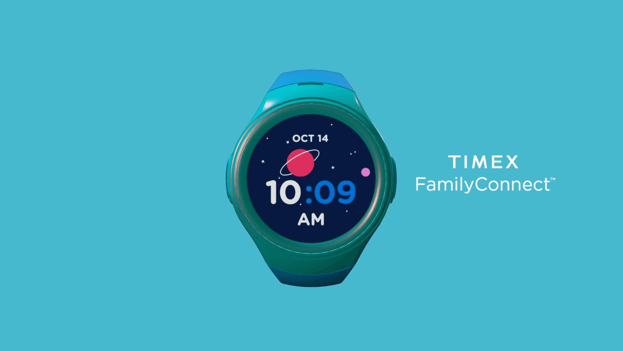
Watch Interface
The final smartwatch interface featured large, colorful icons with minimal text, swipe-based navigation to reduce precise tapping requirements, voice-first interaction for messaging, playful animations as engagement and feedback mechanisms, and simplified settings children could manage within parent-defined boundaries.
Parent Mobile App
The companion app gave parents an at-a-glance dashboard for children's location and status, simple messaging with conversation history, geofencing to create safe zones and trigger boundary alerts, family calendar and reminder management, and full device and settings control.

Key Features
Location Tracking — Real-time GPS with history, customizable safe zones, and alerts. Presented as peace of mind for parents and invisible in the background for children.
Communication Hub — Voice messages, preset text responses, and emoji reactions in a safe, parent-controlled environment. No unknown contacts. No open internet.
Family Calendar — Parents set schedules that appear on the watch, building routines and reinforcing independence while maintaining appropriate oversight.
SOS Function — Easily accessible but protected emergency feature that alerts parents with automatic location sharing. Designed to be usable under stress by a frightened child.
Testing & Iteration
Prototype Testing
Early paper prototypes validated the information architecture cheaply before any design investment. Interactive prototypes in InVision tested navigation patterns before development. Hardware prototypes tested the physical interaction model.
Usability Testing with Parent-Child Pairs
We conducted usability testing with 6 parent-child pairs, observing how both users interacted with the watch and the app together. Tasks covered device setup, messaging, safe zone creation, SOS use, and schedule management.
Iterative Improvements
Based on testing feedback, we made several key changes:
- Simplified the initial setup process after observing parent frustration during first-run
- Enlarged touch targets on the watch after observing children's motor skill variability
- Added confirmation sounds and haptic feedback to improve interaction confidence
- Redesigned messaging to prioritize voice over text after observing children's preferences
- Improved location update frequency based on parent reliability concerns
Results
User reviews consistently highlighted the themes the design was built around: easy to use, peace of mind, great for kids, reliable, and simple setup.
The Timex Family Connect has become an essential part of our family's daily routine. My kids love the independence it gives them, and I love knowing they're just a button press away.
Lessons Learned
Designing for Dual User Groups
Serving both parents and children required constant balancing of different needs, abilities, and mental models. The key insight: optimize each interface for its primary user separately, then focus on making the handoffs between them seamless.
Hardware-Software Integration
Working within hardware constraints was a masterclass in prioritization. Every feature request had to be evaluated against the physical limitations of a small wearable screen. Close collaboration with engineering early in the process was not optional.
Simplicity Beats Features
Carefully curated functionality outperforms feature-bloated alternatives. By focusing on a smaller set of core use cases and executing them well, the product consistently outperformed more capable competitors in user satisfaction.
The Value of Iteration
Small usability improvements discovered in testing often had outsized impact on satisfaction and retention. The difference between a good product and a great one lives in the details — and those details only surface through repeated, rigorous testing with real users.
More Work
Continue exploring
Yale University
YaleSites — Operating a Platform at Scale
Transitioning from Lead UX Designer to Product Manager — owning roadmap, service delivery, cross-functional vendor coordination, and platform infrastructure governance for a multi-tenant live platform serving 2,400+ users across Yale.
View case study
Yale University
YaleSites Platform
Transforming how Yale's 1,500+ websites are built and maintained through a component-based design system and collaborative development model.
View case study
Yale University
Yale DUO Opt-In
Owning end-to-end rollout strategy for Yale's two-factor authentication infrastructure — driving adoption at scale across 20,000+ users through cross-functional execution with security and engineering teams.
View case study