Yale University
Yale DUO Opt-In
Owning end-to-end rollout strategy for Yale's two-factor authentication infrastructure — driving adoption at scale across 20,000+ users through cross-functional execution with security and engineering teams.
- Role
- User Experience Designer
- Timeline
- 2 Weeks
- Company
- Yale University
- UX Design
- Security
- Usability Research
Overview
To improve online security at Yale, ITS planned to roll out two-factor authentication across 20,000+ community members. I owned the end-to-end flow design and rollout strategy — working cross-functionally with the security team and engineering to turn a high-stakes infrastructure deployment into an experience users could navigate without resistance.
The original plan would require users to adapt to the new experience with minimal support — a single warning email and nothing more. Recognized early that this approach would produce confusion, resistance, and increased security risk — undermining the very outcome the infrastructure was meant to achieve.
Problem Statement
As members of the Yale community, our interactions with Yale's online services were about to become more cumbersome due to two-factor authentication. Without clear guidance or user preparation, a forced rollout would undermine the very security outcomes it was meant to achieve.
The core tension: security teams needed full adoption; users needed to feel in control.
Process
Original Plan
The initial proposal divided the Yale community into groups and gradually added each group to the new security plan, with a single email as the only communication. Users would be expected to adapt on their own — no preparation, no context, no choice.
Competitive Analysis
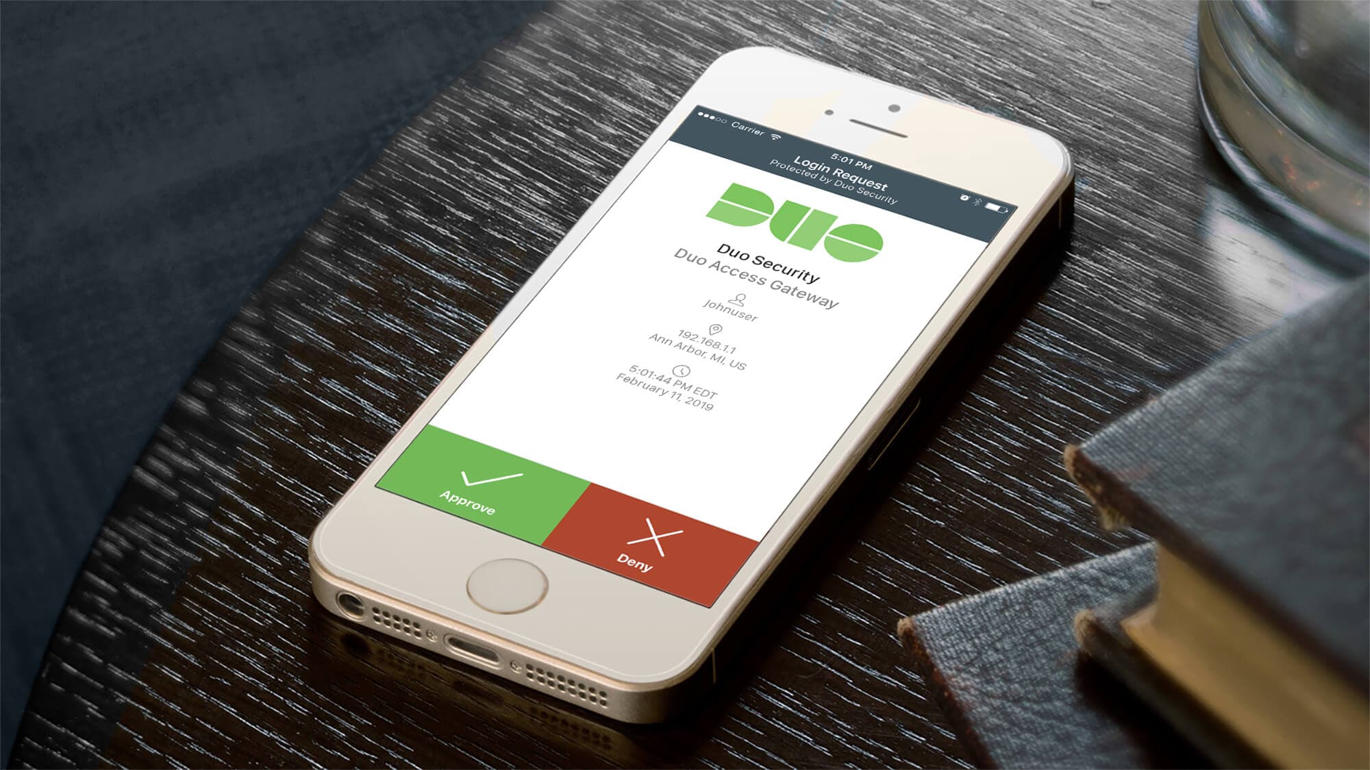
The UX team conducted a competitive analysis of other universities that had implemented two-factor authentication. A clear pattern emerged: the most successful rollouts embedded DUO authentication inside a university-branded webpage. This reinforced user confidence that the service was officially approved — encouraging opt-in rather than triggering resistance.
Solution Strategy: The Illusion of Choice
Our recommendation was an opt-in system where users are flagged for eligibility, then invited to visit a webpage to learn about two-factor authentication and enroll at their own pace. Rather than being forced into a new system, users could feel empowered to opt in themselves.
The process followed five phases:
- Research & Analysis — Studied peer institutions' implementations and conducted user interviews to understand concerns and challenges
- Strategy Development — Created the opt-in approach to give users more control and transparency
- Design & Prototyping — Developed wireframes and prototypes of the opt-in flow with clear system status indicators
- User Testing — Conducted testing to identify edge cases and improve the user flow
- Implementation & Feedback — Launched with built-in feedback mechanisms for continuous improvement

Design Considerations
System Status Visibility
The opt-in process had different outcomes depending on each user's account state — determined by back-end systems. To keep users informed, we designed a three-step progress meter at the top of every screen, making it clear where users were in the process and what came next.
This directly applies Nielsen Norman Group's first usability heuristic: visibility of system status. Users should always know what is happening and what their next step is.
User Preparation
Two-factor authentication is not a light topic. We built the experience around the 5 W's framework to guide users through what to expect:
- What is two-factor authentication?
- When will I be prompted?
- Why does this need to happen?
- Who do I contact if I need help?
- What happens if something goes wrong?
Edge Cases Through User Testing
User testing revealed that users could take meaningfully different paths based on their devices, experience level, and eligibility status. We created a comprehensive user flow to cover all scenarios.
One critical edge case: users whose only registered DUO device was an office landline. While technically compliant, a single office landline as an authentication method — especially during the remote-work era — was a significant security gap. We recommended a back-end check that flags this scenario and prompts users to register an additional device before completing opt-in.

Solution
The final solution was a self-service opt-in webpage where users could learn what two-factor authentication is and why it matters, choose when to begin enrollment, manage their registered devices during the opt-in flow, and receive clear confirmation of every step and its outcome.
Since the launch of DUO Opt-In in 2020, instances of people using compromised NetIDs have dropped to zero.
Results
User feedback collected at the end of the opt-in flow consistently highlighted words like easy, simple, intuitive, clear, and straightforward — a strong signal that a security-heavy process had been successfully made approachable.
Lessons Learned
Empowerment Through Choice
The biggest takeaway was how much user behavior changes when people feel in control. By framing enrollment as a choice rather than a mandate — even when full adoption was ultimately required — the UX team dramatically reduced resistance and confusion.
Edge Case Consideration
The landline scenario showed how real-world user contexts can expose gaps that seem minor in design reviews but become critical in production. Building edge-case discovery into the testing process early is not optional — it is essential.
Behavioral Change Is an Infrastructure Problem Too
The DUO rollout demonstrated that a security infrastructure deployment lives or dies on the user flow wrapped around it. Empathy, preparation, and transparency at the flow level are not soft concerns — they are what determines whether a technically sound system achieves its security outcomes at scale.
More Work
Continue exploring
Yale University
YaleSites — Operating a Platform at Scale
Transitioning from Lead UX Designer to Product Manager — owning roadmap, service delivery, cross-functional vendor coordination, and platform infrastructure governance for a multi-tenant live platform serving 2,400+ users across Yale.
View case study
Yale University
YaleSites Platform
Transforming how Yale's 1,500+ websites are built and maintained through a component-based design system and collaborative development model.
View case study
Timex
Timex Family Connect
Designing a seamless wearable experience that connects families through a child-friendly smartwatch — balancing safety, simplicity, and delight for two very different users.
View case study