Yale University
Yale Single Sign-On
Owning end-to-end redesign of Yale's primary authentication gateway — driving behavioral change at scale for 35,000+ daily users through cross-functional execution with security, identity management, and engineering.
- Role
- Lead UX Designer
- Timeline
- 3 Months
- Company
- Yale University
- UX Design
- Accessibility
- Identity & Access Management
Overview
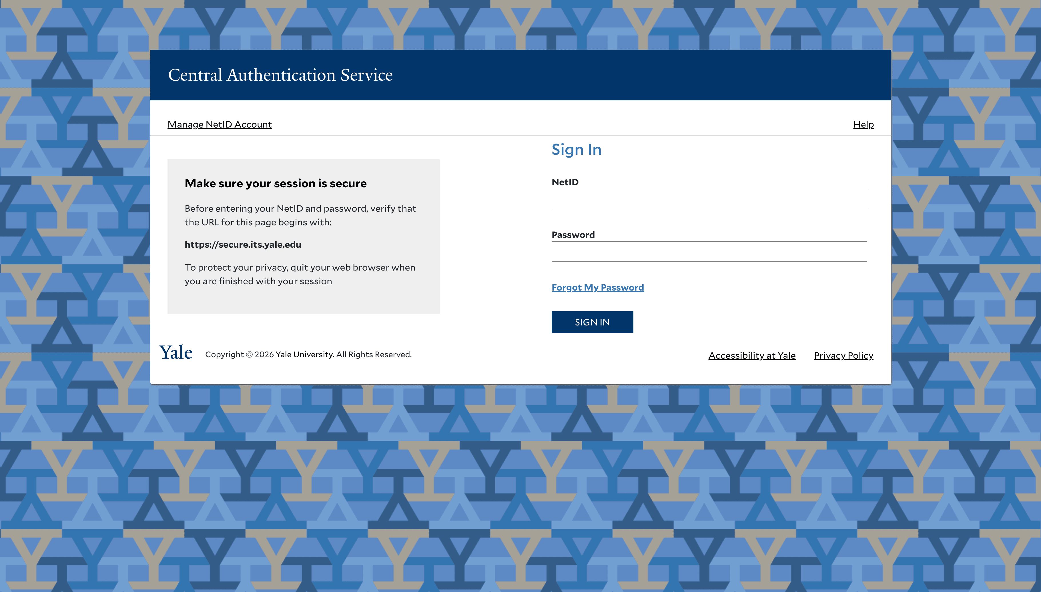
The Yale Single Sign-On (SSO) system is the primary authentication gateway for the entire Yale community — serving over 35,000 students, faculty, and staff every day. As the critical entry point to Yale's services, it had to be reliable, accessible, and trustworthy at institutional scale.
I owned the end-to-end redesign of the authentication flow — login screen, password reset, error handling, and account management — coordinating across IT security, identity management, and engineering to deliver a more reliable, accessible experience without introducing risk to the infrastructure underpinning 35,000+ daily users.
The login page is the most frequently used page at Yale, yet it was failing to meet basic usability and accessibility standards.
Problem Statement
The existing Yale SSO system had accumulated years of technical debt and design inconsistency:
- Inconsistent branding across different authentication screens
- Poor accessibility creating real barriers for users with disabilities
- Unclear error messages with no actionable recovery paths
- Limited responsive design resulting in a frustrating mobile experience
- Difficult password reset flow driving high support ticket volume
These issues did not just create friction — they created security risk. When authentication is confusing, users find workarounds that undermine the system entirely.
User Research
Research Methodology
To understand the scope of the problem, I conducted a multi-method research approach:
- Reviewed 500+ help desk tickets related to login issues
- Conducted contextual interviews with 15 users across students, faculty, and staff
- Performed a full WCAG 2.1 AA accessibility audit of all authentication screens
- Ran moderated usability testing with 8 participants, including users with disabilities
- Analyzed authentication systems at peer institutions for competitive context
Key Findings
Users were most frustrated by:
- Error messages that identified a problem but offered no path forward
- Password requirements invisible until a rule was already broken
- Mobile navigation requiring excessive zooming and horizontal scrolling
- Inconsistent visual cues that left users uncertain they were on a legitimate Yale page
- Screen reader incompatibility that made the flow entirely inaccessible for some users
Design Process
The project moved through seven phases, each building on the last:
- Define Requirements — Collaborated with IT security, identity management, and accessibility experts to establish technical and compliance constraints before touching the interface
- Flow Architecture — Mapped user flows for all authentication paths, including every edge case and error state, to define the full behavior surface
- Wireframing — Created low-fidelity wireframes focused on interaction patterns and recovery paths across device types
- Interface Specification — Developed high-fidelity specifications aligned with Yale's brand and WCAG 2.1 AA compliance
- Prototyping — Built interactive prototypes for user testing and cross-functional stakeholder review with security and engineering
- Testing & Iteration — Conducted multiple rounds of usability testing and iterated based on findings across user roles and accessibility needs
- Implementation — Partnered with engineering to verify production fidelity, accessibility compliance, and behavioral correctness across all authentication paths
Design Principles
Five principles guided every decision throughout the process:
- Accessibility first — WCAG 2.1 AA compliance as a floor, not a ceiling
- Mobile responsiveness — a consistent experience across all device sizes
- Clear communication — helpful feedback and plain-language error messages
- Security without friction — strong security that does not punish legitimate users
- Yale brand trust — consistent visual identity that reinforces confidence


Solution
Redesigned Login Screen
The new login screen featured clear Yale branding, a simplified layout focused on essential elements, prominent recovery options, full responsive design, and a keyboard-navigable high-contrast interface.
Improved Error Handling
I completely redesigned the error messaging system to use plain language, provide actionable next steps, display errors inline next to relevant fields, use appropriate ARIA attributes for screen reader users, and maintain security without revealing unnecessary information.
Streamlined Password Reset
The new password reset flow reduced steps from 7 to 4, added real-time password requirement validation, included progress indicators for multi-step processes, offered multiple recovery options, and provided clear confirmation at each stage.
Account Management Dashboard
A new self-service dashboard let users view and update profile information, manage security settings, configure recovery options, and monitor recent account activity — reducing reliance on the help desk for routine tasks.
Testing & Validation
Usability Testing
Moderated usability tests with 12 participants covering standard login, error recovery, password reset, and account management. Participants represented diverse roles, technical skill levels, and accessibility needs.
Accessibility Testing
Thorough testing with NVDA and VoiceOver screen readers, full keyboard navigation verification, color contrast analysis for all interactive states, testing with magnification tools up to 400%, and automated WCAG 2.1 AA compliance checks.
A/B Testing
A phased rollout enabled A/B comparison of login completion rates, time to successful authentication, error recovery success rates, and support ticket generation rates.
The new SSO design is significantly more intuitive. I can finally use the password reset function without calling the help desk.
Results
Beyond the metrics, the redesign had lasting organizational impact:
- The authentication flow patterns were adopted as the campus standard across other Yale web applications
- The project received recognition from Yale's Office of Digital Accessibility
- IT support reported significantly fewer escalations related to authentication
- Established a model for cross-functional delivery — security, identity management, engineering, and UX working from shared requirements rather than in sequence
Lessons Learned
Balancing Security and Usability
The biggest ongoing tension was finding the right balance between security requirements and usable design. Close collaboration with the security team early revealed that most friction points were implementation choices — not security requirements — and many could be resolved without compromising protection.
Inclusive Design Benefits Everyone
Prioritizing accessibility from the beginning created a system that was better for users with disabilities and noticeably better for all users — particularly in challenging contexts like mobile usage, poor network conditions, and unfamiliar devices.
The Importance of Error States
Well-designed error states are disproportionately impactful on overall experience quality. Investing in clear, helpful error messaging was one of the highest-leverage design decisions in the entire project.
More Work
Continue exploring
Yale University
YaleSites — Operating a Platform at Scale
Transitioning from Lead UX Designer to Product Manager — owning roadmap, service delivery, cross-functional vendor coordination, and platform infrastructure governance for a multi-tenant live platform serving 2,400+ users across Yale.
View case study
Yale University
YaleSites Platform
Transforming how Yale's 1,500+ websites are built and maintained through a component-based design system and collaborative development model.
View case study
Yale University
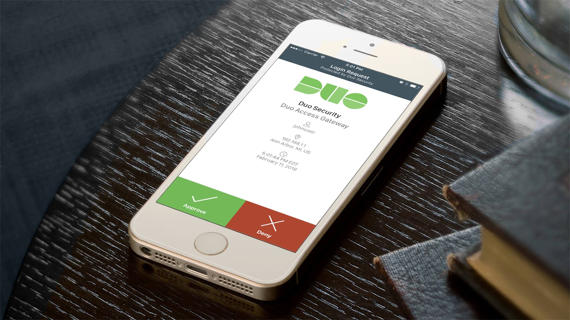
Yale DUO Opt-In
Owning end-to-end rollout strategy for Yale's two-factor authentication infrastructure — driving adoption at scale across 20,000+ users through cross-functional execution with security and engineering teams.
View case study